- 1 min to read
Finding the best way to create animated gradient borders in CSS
Want to elevate your website design with eye-catching animated gradient borders? Let's explore four techniques to achieve this stunning effect in CSS.


By Mojtaba Seyedi

Creating a gradient border and animating it in CSS can be tricky. Let's dive into some ways to do it together in this experiment.
The effect
The markup
The border-image property
For a border without radius needs, use border-image:
Using an extra element
To maintain radius with no transparency:
Using multiple backgrounds
You can combine backgrounds and use more background properties to achieve the same effect.
Using masks
If you need both transparency and radius, CSS masking is the way.
Animating a gradient border
We can use CSS Houdini to animate a gradient border.
For browsers that don't support Houdini, you can utilize the CSS @supports feature. This ensures users still receive the gradient, even if they can't view the animation.
The pros and cons of each technique
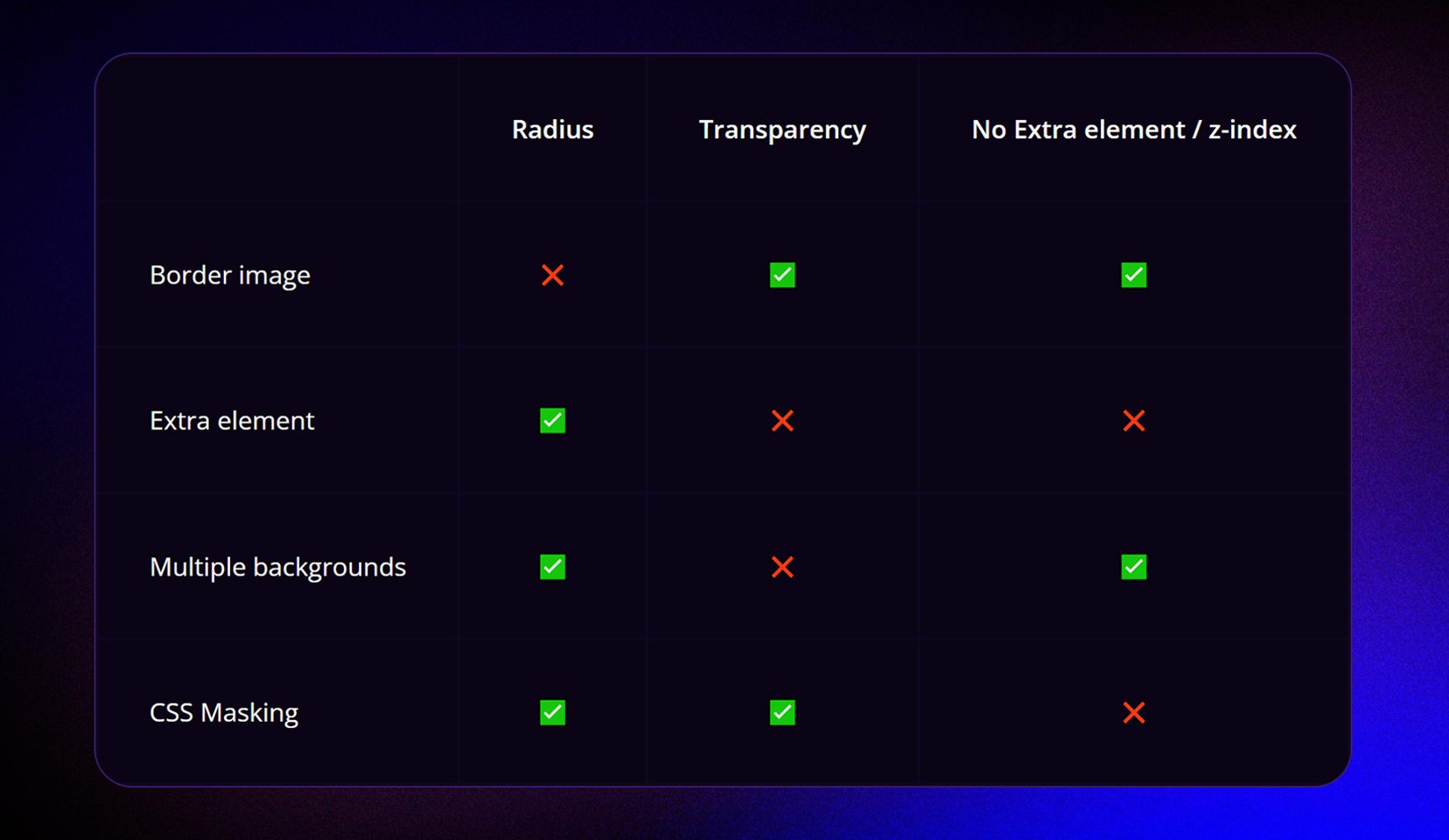
The border image technique
No radius, but allows a transparent background and eliminates the need for an extra element, avoiding z-index issues.
Using an extra element
Provides a radius but lacks transparency and may pose potential z-index challenges.
Multiple backgrounds method
Gives us the radius but doesn't offer transparency; it bypasses z-index complexities.
CSS Masking
Offers both radius and transparency but presents a z-index drawback.
How to choose the best way to create a gradient border
I made the following flowchart to illustrate how you can choose the best option.
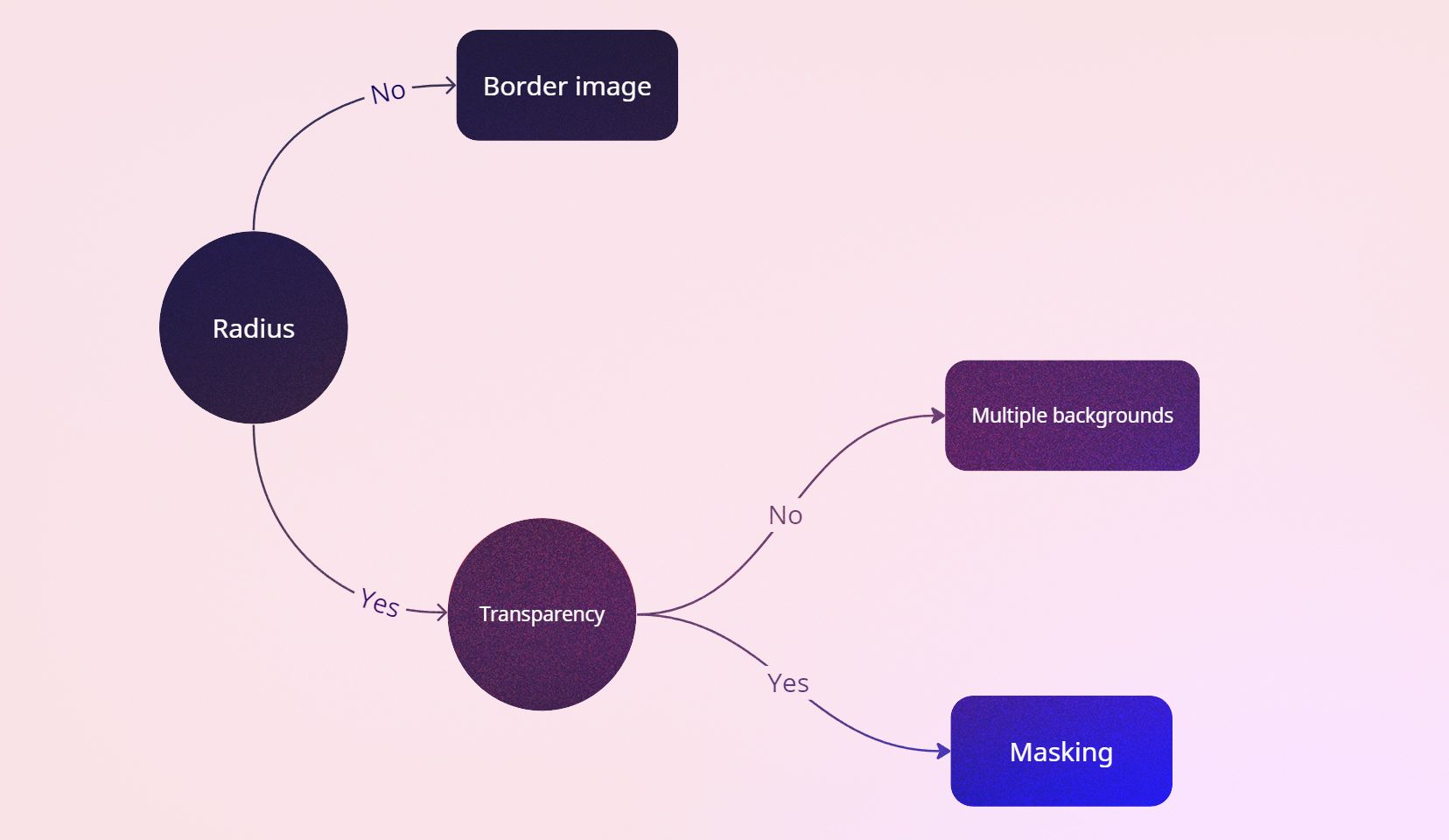
If a radius isn't necessary, opt for the border-image technique. Need a radius? If transparency isn't required, use multiple backgrounds. For a transparent background with a radius, CSS masking is the solution.
The future is bright
Join the conversation initiated by Lea on GitHub regarding a potential CSS value for gradient borders.
The video and demo
Do you want to learn all about these techniques? You can watch me explain them on YouTube.
For a live demo and source code, check out our GitHub repository: Bejamas Experiments.