Knowledge Hub
Finding the best way to create animated gradient borders in CSS
Creating a gradient border and animating it in CSS can be tricky. Let's dive into some ways to do it together in this experiment.
The effect
The markup
<article class="card">
  <h1 class="card__title">Audit your project</h1>
  <p class="card__description">As your business grows, so does your codebase.</p>

  <div class="media-object">
    <div>
      <h2 class="media-object__title">Your frontend doesn't have to be a mess.</h2>
      <a class="media-object__button">Get Your Audit</a>
    </div>
    <div class="media-object__thumbnail"></div>
  </div>

  <div class="card__actions">
    <a class="card__button">Example Audit</a>
    <a class="card__button">Paid & free Plans</a>
  </div>
</article>
The border-image property
For a border without radius needs, use border-image:
.media-object {
  border: 1px solid;
  border-image: conic-gradient(#381D6A 80%, #E0D1FF 88%, #E0D1FF 92%, #381D6A 100%) 1;
}
Using an extra element
To maintain radius with no transparency:
.card {
  isolation: isolate;
}

.media-object {
  --border-width: 1px;
  --radius: 24px;
  --bg-color: #0F0620;

  position: relative;
  border: var(--border-width) solid transparent;
  border-radius: var(--radius);
  background-color: var(--bg-color);
  background-clip: padding-box;
}

.media-object::before {
  content: " ";
  position: absolute;
  inset: calc(var(--border-width) * -1);
  z-index: -1;
  border-radius: inherit;
  background-image: conic-gradient(#381D6A 80%, #E0D1FF 88%, #E0D1FF 92%, #381D6A 100%);
}
Using multiple backgrounds
You can combine backgrounds and use more background properties to achieve the same effect.
.media-object {
  --border-width: 1px;
  --radius: 24px;
  --bg-color: #0F0620;

  border: var(--border-width) solid transparent;
  border-radius: var(--radius);
  background-image: linear-gradient(var(--bg-color) 0 0),
                    conic-gradient(#381D6A 80%, #E0D1FF 88%, #E0D1FF 92%, #381D6A 100%);
  background-clip: padding-box, border-box;
  background-origin: padding-box, border-box;
}
Using masks
If you need both transparency and radius, CSS masking is the way.
.card {
  isolation: isolate;
}

.media-object {
  --border-width: 1px;
  --radius: 24px;

  position: relative;
  border-radius: var(--radius);
  border: var(--border-width) solid transparent;
}

.media-object::before {
  content: " ";
  position: absolute;
  inset: calc(var(--border-width) * -1);
  z-index: -1;
  border: inherit;
  border-radius: inherit;
  background-image: conic-gradient(#381D6A 80%, #E0D1FF 88%, #E0D1FF 92%, #381D6A 100%);
  background-origin: border-box;
  mask: linear-gradient(black, black),
        linear-gradient(black, black);
  mask-clip: content-box, border-box;
  mask-composite: exclude;
}
Animating a gradient border
We can use CSS Houdini to animate a gradient border.
.media-object {
  --border-width: 1px;
  --radius: 24px;
  border: var(--border-width) solid;
  border-image: conic-gradient(from var(--angle), #381D6A 80%, #E0D1FF 88%, #E0D1FF 92%, #381D6A 100%) 1;
  animation: spin 3s linear infinite paused;
}

.media-object:hover {
  animation-play-state: running;
}

@property --angle {
  syntax: "<angle>";
  inherits: true;
  initial-value: 0turn;
}

@keyframes spin {
  to {
    --angle: 1turn;
  }
}
For browsers that don't support Houdini, you can utilize the CSS @supports feature. This ensures users still receive the gradient, even if they can't view the animation.
@supports not (background: paint(something)) {
  .media-object {
    border-image: conic-gradient(#381D6A 80%, #E0D1FF 88%, #E0D1FF 92%, #381D6A 100%) 1;
  }
}
The pros and cons of each technique
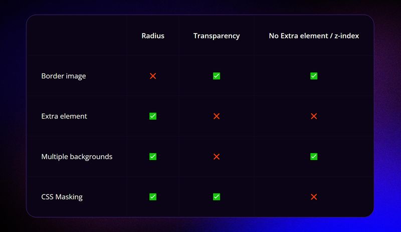
The border image technique
No radius, but allows a transparent background and eliminates the need for an extra element, avoiding z-index issues.
Using an extra element
Provides a radius but lacks transparency and may pose potential z-index challenges.
Multiple backgrounds method
Gives us the radius but doesn't offer transparency; it bypasses z-index complexities.
CSS Masking
Offers both radius and transparency but presents a z-index drawback.
How to choose the best way to create a gradient border
I made the following flowchart to illustrate how you can choose the best option.
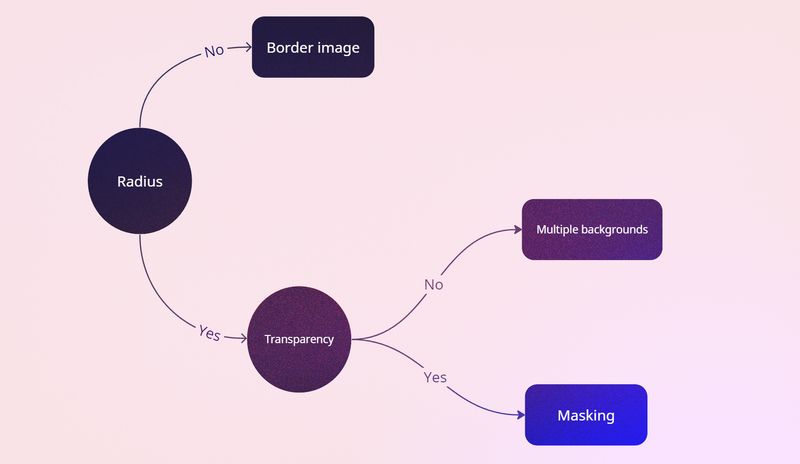
If a radius isn't necessary, opt for the border-image technique. Need a radius? If transparency isn't required, use multiple backgrounds. For a transparent background with a radius, CSS masking is the solution.
The future is bright
Join the conversation initiated by Lea on GitHub regarding a potential CSS value for gradient borders.
Demo
For a live demo and source code, check out our GitHub repository: Bejamas Experiments.