How Storybook Transforms Design Systems for Consistent User Interfaces
September 25, 2024
5 min

In the fast-paced world of digital design and development, maintaining a consistent and cohesive look across all platforms can be challenging. A robust design system is key to ensuring uniformity and efficiency. But how do you keep your design system in check as your project grows? Let’s explore how Storybook can help manage design consistency and transform your workflow.
Why Having a Design System is Essential
Having a design system is crucial for any organization looking to maintain a consistent and professional appearance across all digital platforms. It acts as a centralized source of truth that guides both designers and developers. A design system makes sure every visual and functional element aligns with your brand’s identity. This consistency not only strengthens your brand's image but also provides a seamless experience for users, which helps them to trust and engage with your product more.
A design system boosts efficiency and supports better collaboration among teams. With a set of pre-built components and clear guidelines, designers and developers can work more quickly and reduce the chances of miscommunication. This means less time spent on repetitive tasks and more time for creativity and innovation, which leads to a faster project completion and a higher-quality product.
But keeping a design system consistent comes with its own challenges.
The Challenges of Consistency in Design Systems
As your product evolves, so do the components within your design system. This makes it difficult to ensure that everything stays aligned across different teams and projects. So, it’s common to see different parts of a company’s digital presence start to look and feel inconsistent after some time.
This phenomenon happens for a few reasons:
- Different teams often work on their own without much coordination.
- As the design system changes, some products don't get updated, so the updates aren't applied everywhere.
- Developers might tweak things without checking with the design team, which can gradually cause the designs to drift apart.
Without a proper way to manage and visualize different elements and components, it’s easy for inconsistencies to creep in and break the user experience. This is where a tool like Storybook becomes invaluable.
What is Storybook?
Storybook is a powerful tool that allows you to develop, test, and showcase UI components in isolation from your main project. Imagine it as a visual library where all the pieces of your web website, like buttons, forms, and widgets, are displayed and organized. This makes it easier for designers, developers, and stakeholders to review and collaborate on each component without the need to dive into the full project.
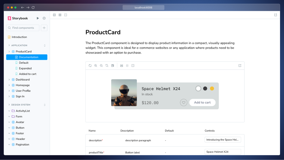
Screenshot is from Storybook website
Using Storybook is a great way to keep your project consistent. It lets everyone see how components will look and work in different situations. If you need to make changes, Storybook helps you spot issues quickly, making sure those updates are applied everywhere and don’t cause other parts of your project to look or behave differently. This way, small changes don’t lead to big inconsistencies over time.
Storybook has plenty of benefits, but first, let’s find out who uses it and how it helps different companies.
Storybook Adoption Across Industries
From media giants like the BBC and The Guardian to design leaders like Adobe, and tech powerhouses such as Microsoft and GitHub, Storybook is a trusted tool across various industries. E-commerce leaders like Shopify and innovative platforms like Airbnb also rely on Storybook to maintain consistency and efficiency in their user interfaces. Even NASA's Jet Propulsion Laboratory utilizes Storybook for its cutting-edge projects.
But what exactly makes Storybook so beneficial?
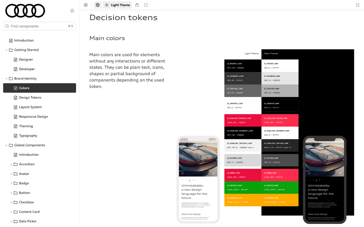
Screenshot from the Audi design system using Storybook
The benefits of Storybook
Here’s why companies like Adobe, Microsoft, and Shopify rely on Storybook:
- Simplifying complexity with component isolation: In modern UI development, managing multiple components with varying use cases can be overwhelming. Storybook allows developers to build, test, and document components in isolation. This means each component can be developed independently, so all edge cases can be handled without the complexity of the entire project. This focused approach leads to more robust and reliable components.
- Enhancing team collaboration: Storybook isn’t just for developers; it unites designers, developers, and stakeholders by allowing them to interact with the actual, fully-functional components. This is so different that opening a static Figma project in a meeting, Storybook presents the real UI elements in action. This ensures everyone sees the final components in action which helps with better alignment and quicker feedback loops.
- Streamlining live documentation: Documentation is often a pain point in development, but Storybook simplifies this by automatically generating documentation for each component. This documentation includes live examples, making it easier for teams to understand how components work and how they can be reused across different projects. By providing clear documentation, Storybook lowers the risk of inconsistencies that can arise when integrating new team members into the project.
- Improving Testing and Accessibility: With Storybook, testing isn’t an afterthought. It integrates accessibility, interaction, and visual tests directly into your workflow. This helps developers catch issues early, making sure that each component is production-ready.
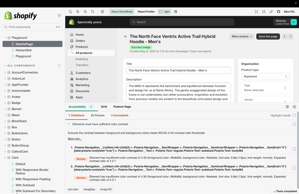
Demonstrating accessibility violations in shopify design system built in Storybook.
Storybook guides teams through a streamlined workflow that starts with developing components in isolation. Next, built-in tools handle automated testing for accessibility, interaction, and visual aspects. Once components are validated, the team can review and align by publishing the Storybook for sign-off. Documentation is then automatically generated from the stories, and these can be easily shared by embedding them in tools like wikis and Figma to demonstrate how the UI actually functions.
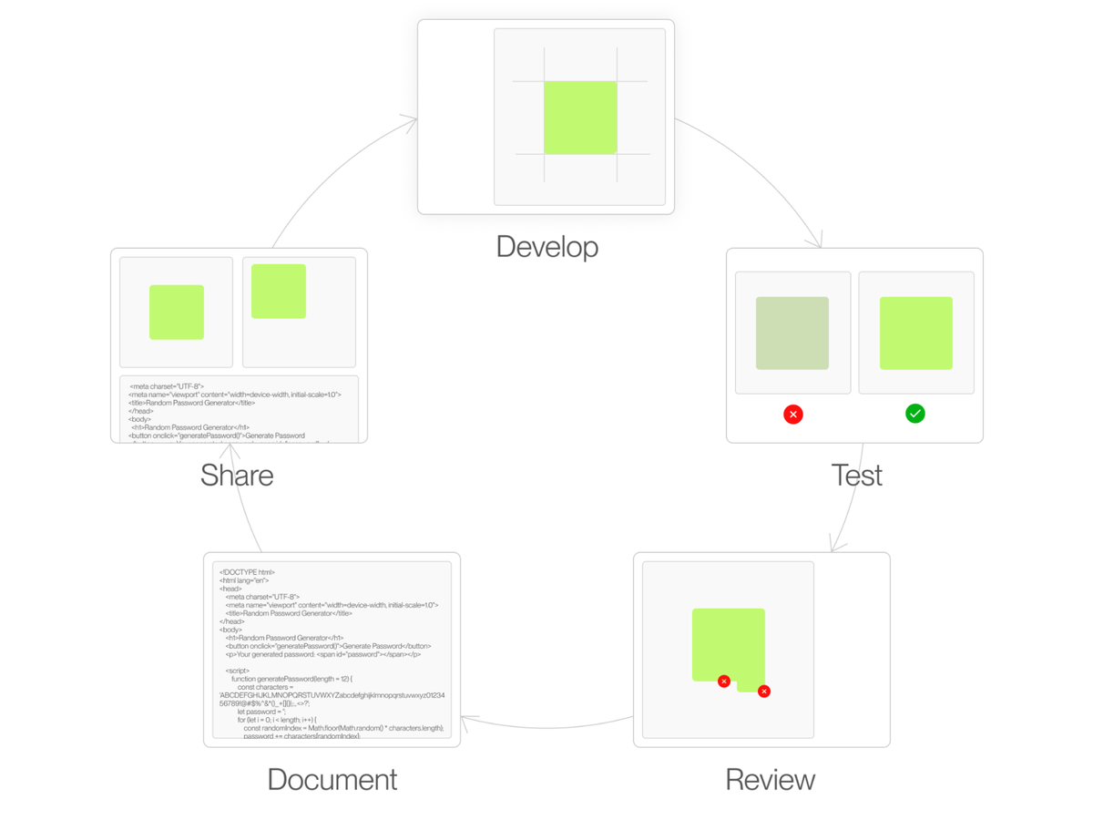
Now that we’ve covered the key benefits of Storybook and its widespread adoption across industries, you should have a good sense of why it’s such a valuable tool for keeping design systems consistent and collaborative.
The next section is a quick look at how we integrate Storybook at Bejamas, particularly with Figma. If you're not a designer or developer, feel free to stop here—but if you're interested in a simple, practical guide, read on!
The steps we take to implement Storybook
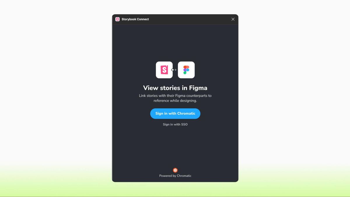
Embed Storybook in Figma
Storybook Connect lets you connect Stories directly to your Figma components. This is how you can compare the implementation vs design in real time.
- Find and use Storybook Connect from your Figma integrations list;
- Sign in with Chromatic;
- Open story in Storybook;
- Copy the URL for the story from the address bar;
- Select the component in Figma, run the plugin once again and paste the URL.
Chromatic automatically pulls updates from the Storybook so you are going to be up-to-date with the branch you have linked.

Embed Figma in Storybook
If you want to have a side-by-side comparison in Storybook, you need to use Designs add-on. It automatically creates a new panel with the Figma iframe.
Install the add-on:
npm install -D @storybook/addon-designs

yarn add -D @storybook/addon-designs

pnpm add -D @storybook/addon-designs
Register the addon in the main.js file:
export default {

  addons: ["@storybook/addon-designs"],

};
Add it to your story:
export default {
  title: "My stories",
  component: Button,
};

export const myStory = {
  parameters: {
    design: {
      type: "figma",
      url: "https://www.figma.com/file/LKQ4FJ4bTnCSjedbRpk931/Sample-File",
    },
  },
};
Conclusion
At Bejamas, we specialize in helping large companies with multi-website projects maintain a consistent and cohesive design system. For Bennetts, a leading UK motorbike insurance broker, we redesigned and implemented three websites. Similarly, for HanseYachts, one of the world’s largest yacht builders, we created distinct designs for seven different brands while maintaining overall design consistency and reducing maintenance costs with a single design system.
If your company needs help streamlining large-scale digital projects, Bejamas is here to help. Contact us to future-proof your digital presence and elevate your brand’s user experience.
Authors
 Mojtaba Seyedi
Share


